Tuesday 29 December 2009

Please, don't thank me all at once.

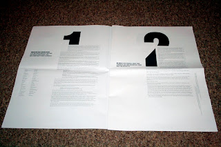
In the spirit of good old Christmas procrastination hard work, I have spent the last 2 days developing a new font. For some reason I have felt inspired to make a font since my visit to Stockholm, and so have appropriately named it after the city (albeit with a different spelling) - A_B_ Stochome.
The font is still in the beta stages (the kerning isn't perfect, and I haven't yet included numbers or punctuation) however I hope to polish it off soon enough. I created using a modular method, using a square, half a semicircle and a line. (hence the shapes at the bottom of the poster)
Anyway, below is a sample of it. It is available to download HERE, but only 10 times. (if there is an overwhelming rush for it - i.e. 11 people want it, which I highly doubt, then I will re-upload it.)


Wednesday 23 December 2009

Happy 23rd December.

I don't particularly enjoy Christmas (not in a 'bah humbug lets be grumpy for the sake of it' way, I just don't really 'get' it).
So here's a video that has nothing to do with Christmas, but is certainly way better.


If anybody wants to buy me a Christmas present, maybe get me a flight back to Iceland?
Don't bother with the return.

Thursday 17 December 2009

Is there anything new?


I am going to strive to make something different.

Friday 11 December 2009

A few photos from sweden.

Whilst in Sweden in November, I took up the opportunity to further develop my photography skills, particularly in the area of long-exposure.
Below are a few images that I took at night, venturing out into the bitter cold of the swedish outdoors.
These photos are merely works in progress, I have many photos yet to edit, and the ones below are not yet finished. I hope to create a book of my final images for my silence project.


OneDotZero Progress.

Below is a visual style test for Me, Ste and Arrons onedotzero 'disappearing city' brief, in which we are basing upon the idea of singularity.
We have been looking at influences such as 60's modernism and architecture, and will use these influences for lots of the animation. The animation below is a visualisation of within 'singularity' and so will use different influences than the rest of the animation.
The test is below:


Singularity visual style test. from Adam Brandon on Vimeo.

I'm quite pleased with the animation, however I think it looks a little bit to like 'tron' and as this is a look that is quite cliched, I need to further develop my own visual style.

Saturday 28 November 2009

Back into 3D

The other day, I got hold of a copy of the latest version of Cinema 4D. As I needed to get back into the program for the OneDotZero project, I took it as a good opportunity to have a play!
I tried to create an animation in the style of Universal Everything - to see if I could to it technically.
I'm fairly happy with the result, and may add some sound design to the animation soon. It has also helped me get back into Cinema 4D in time for the OneDotZero project and the Jonny Hardstaff brief!


Colour in motion from Adam Brandon on Vimeo.


However the video has gone a little glitchy when uploading (which wasn't intentional) so I may try uploading it again with different settings.

Wednesday 25 November 2009

Tuesday 24 November 2009

I've packed a change of clothes and it's time to move on.


I am sorting through my sweden photos at the moment and will post more very soon.

12in12: a lecture by Craig Oldham.

Today we had a great lecture by designer Craig Oldham, formerly of the Chase and now of Manchester based design agency Music.
Craig presented his lecture '12in12' which was a lecture based on his thoughts after leaving university, most notably the 12 things you learn in your first 12 months after leaving.
This was a great lecture, and I learned a lot about the industry, and how to communicate to people and maintain working and social relationships with people who you have been on placement with (which I, admittedly, am terrible at.)

The 12 things are:

Understand what Graphic Design means to you.
Be honest with yourself about your strengths and weaknesses.
A portfolio is for life, not just for an interview.
Placements matter. Do them.
The Design industry is small, everyone knows everybugger else.
Participate with other people and share your ideas.
Graphic Design is just a job, but being a designer is different.
Fall off your bike. If you don't fail then you are not trying.
Life and work exist outside of London.
Designing is only, about, 20% of your job.
Have a life outside of Design.
Work hard and be nice to people.

We also got a lovely designed pamphlet/loose leaf booklet illustrating all 12 points.


A Present in the Post (pt.2)

A couple of weeks back I woke up to find an odd letter shaped package addressed to me, posted all the way from Singapore!
To my delight, I opened it to find it to be a limited edition 15th anniversary poster from the guys over at IDN Magazine!

Now just to decide where to put it...


Cheers IDN!

Wednesday 18 November 2009

D&AD Brief Time. - OneDotZero

Yesterday we had to choose which brief to undertake for our competition brief section of the course. The projects were very diverse, ranging from advertising to craft, and motion to print.
Eventually, after much thinking, I came to a decision, which was to have a go at the OneDotZero brief, which is below...

Brief:
The City is constantly in transition and mutation, disappearing
behind changing environments and shifting identities. Create your
own ‘adventure in motion’ that explores this.  

Creative Challenge:
Mankind’s fascination with city living continues at a startling pace, accelerating towards nations of supercities. From personal stories to community collectives, it’s time to investigate how cities are changing and in turn how we are changing our cities, our hopes and fears of urban dwelling both now and in the future.
We want you to explore the concept of ‘The Disappearing City’ via a progressive, multi-disciplinary, cross-media approach to storytelling, with a work of moving image at the heart of your final piece. Do not limit yourself to making a finished film if you don’t want to. onedotzero is about experimentation with moving image in any context, so as well as film and animation, experimental work in motion graphics, installations and even live action are relevant.
We are looking for work that can be extended into different mediums, please demonstrate this by extending your core piece into at least one other medium. Think broadly, it can be anything from online to print, from mobile to interactive, from public intervention to papercraft or gaming, and so on.


I will be doing this project with fellow designers Ste Beed and Arron Tierney, check out their blogs:
Ste Beed
Arron Tierney

Sunday 15 November 2009

Bar_Code_s

Just found these amazing barcode designs from Japan! I think its a really cool idea to make the barcodes interesting and I love some of the crazy japanese designs!
The company that makes them is called D Barcode and their website is HERE

Let the right one in.

We watched the swedish film 'Let the right one in' a few weeks ago in Kino 4, our Uni/D&AD film club. I cannot express how much I enjoyed this film.
It is about a Swedish boy named Oskar, and a young female vampire he meets called Eli. I won't go heavily into the plot, but its a very interesting film.
Its also possibly one of the most well shot films in terms of Cinematography that I have ever seen. Every shot is beautiful, like a well taken photograph.
It has rekindled my long running love with all things Scandinavian, and I loved the film so much that I booked a flight to Sweden the next day, I depart on the 20th.
The only thing wrong with the film is the DVD packaging, which I feel totally misrepresents the film. It presents it as a horror vampire movie, where the film is really an intriguing drama about different cultures and young love. I may take it up on myself to redesign the DVD packaging as a self initiated project, to represent the film better.


Poster4Tomorrow

Today I submitted my design for the Poster4Tomorrow poster competition. The poster had to relate to freedom of expression, and I created the design below.


I also had to submit an explanation of the work:

"The poster is a reaction to the censorship (the un-free press) in American Society, the way in which American news reports give a highly based and censored view of what happens in the world around us. People now have to look online at blogs created by independent reporters and people who are actually living through these events to hear the real truth, to find out what is really happening.
The pen is used as an image to represent the written word, although not necessarily printed. As I said above, blogs are now a main source for free speech, and I believe that these blog writers are our new literary heros, using the written word to speak to million of people.
The ink flowing from the pen shows how these messages trickle down through society and eventually uncover the real story, with the ink washing over and thus removing the censorship. The text is a definition of the work censorship and the colours are influenced by the USA flag, which, although a little cliched, I feel is relevant to the message of the piece."

The explanation was a little shoddy, as I looked at website to see when the deadline was, and it happened to be in 15 minutes! Therefore I submitted the poster as-is (i was going to work on it some more) and quickly wrote my thoughts on the work!
The 100 chosen designs will be submitted in Paris, with the top 5 put on permanent exhibit at the International Poster Museum in Finland.
-
www.poster4tomorrow
-

The American Scene: Prints from Hopper to Pollock

Today I visited the Whitworth Art Gallery, and looked mostly at the 'American Scene' exhibition.
It focused on North American printmaking from around 1908 to the 1950's, and featured artists such as Jackson Pollock, John Sloan, George Bellows and Edward Hopper.
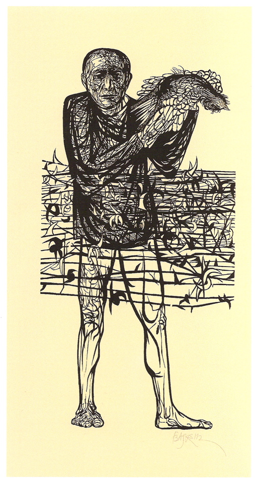
This was a great exhibition, and featured some great work. It introduced me to 2 amazing artists that I had never before encountered, Louis Lozowick and Leonard Baskin.
Louis Lozowick was an American Precisionist, and created some fantastic images of New York city using print and illustration techniqies. Something about his works really speaks to me, and keeps me enthralled. Maybe its the precision of his work, or maybe its just that I love dark images of urban landscapes.


Leonard Baskin was a celebrated american printmaker and illustrator. His work is quite diverse, and he created quite a of of work during the second world war.
He had 2 amazing pieces at this exhibition, 2 prints entitled 'Man of Peace' and 'Hydrogen Man.'
I found these 2 pieces fascinating. Both are anti war illustrations and both I feel are very powerful. His 'Hydrogen Man' piece was my favorite in the whole gallery.


Craft and Design

Yesterday I ventured out into the rain to the Craft and Design centre in the Northern Quarter. I hadn't been there in a while and it was a very refreshing change to the hustle and bustle of most of the city centre. They have some great stalls selling art, jewellery, textiles and more. I got some great ideas for Christmas presents and also for some self directed projects.
The most interesting part of my trip was the current 'Yarn Forward' project, whereby people send in small knitted sections to add to the craft centre 2nd floor banister, to create a huge, flowing tapestry like piece of art!
I forgot to take my camera, however below is a link to the Yarn Forward blog, plus a link to the Craft and Design Centre site.


Yarn Forward

Craft and Design Centre

Microbiology and Art.

On thursday I attended a lecture by the special collections library entitled 'Microbiology and Art.'
The Lecture was about how microorganisms are infact very beautiful creatures, and how they have been used for art, as well as the correlations between the development of the science and the developments of art.


The lecture involved all sorts of interesting facts, such as how stress affects the growth of microorganisms, creating different looking colonies, and how architects use the same structures as viruses for some architectural projects (such as the eden project.)
We were also shown various art projects inspired by microbiology, such as some beautifully intricate glass models of funghi, and a collaboration between the muscular dystrophy foundation and somerfield where a double helix based upon the structure of DNA (or Deoxyribonucleic acid, if we're getting scientific) was created out of shopping trolleys! 


I found this lecture hugely inspirational, as I have studied quite a lot of science (I almost decided upon going to medical school before I opted to go to uni to study design instead) and still find it fascinating. I could see so many correlations between this subject and the process of generative design, another subject very close to my heart. It reminded me most of Universal Everything's 'Seconde Nature' reactive identity system:


Seconde Nature / Reactive Identity from Universal Everything on Vimeo.

This has really got me into looking at generative design again. If anyone reading this is interested, there is a great site full of generative stuff right HERE

Wednesday 11 November 2009

Placement with The Designers Republic.


In October, I undertook a 2 week placement at The Designers Republic in Sheffield.
This was a huge thing for me, as not only are the Designers Republic one of the most famous design studios around, they are also my favorite.
I was initially asked to come for a placement way back in may, however due to miscommunication and sheer lack of organization, it didn't happen until October.


Being so notorious, I was rather nervous upon my first day. The 55 minute train Journey seemed to take forever, and I didn't no whether to be giddy or terrified. After all, my work would be scrutinised by Ian Anderson, who I know from previous experience is certainly not afraid to speak his mind!
Once I got there I realised I had nothing to be afriad of. The studio has a very friendly, creative atmosphere, all to the backdrop of Ians eclectic music taste.
I set about working on some ideas for the new Gatecrasher album that tDR are working on. They wanted the album art to reflect Pink Floyds 'Wish You Were Here' (as the last gatecrasher album was based on Dark Side of the Moon.) I was responsible for coming up with design for the CD's themselves, a harder task than I originally thought it would be! The Designer Republic tagline is 'Brain Aided Design' and I can now completely see what that means, as everything tDR to needs to have a lot of thought behind it. So, I spent the first few hours thinking and making quick sketches, determined to have some good ideas before I got onto Adobe Illustrator.
Note that although I used Illustrator, Macromedia FreeHand is the preferred method of computer aided design at tDR, Ian says that the way it works makes you 'think about what you are doing a lot more.' However, as I was only there for 2 weeks, I used Illustrator as I wouldn't be able to work on a program I didn't know!
This way of working (thinking a lot more and making sure you have plenty of good ideas) is actually quite new to me, as I usually jump onto the mac way too quickly. However I have discovered that I can design much better when I bother to think beforehand...
The CD design actually took days, as I created about 70 different ideas all made in illustrator to present to Ian.
I also worked on the imagery for the inlay booklet. I was given the task of finding images of people at Gatecrasher clubs losing themselves in the music. I found about 50 images in the end, which Ian wanted cropping right into their faces, so that all you would be able to see in the inlay was faces. After cropping them all, I was given the talk of editing them in photoshop to give them a 'warm, saturated feeling' (as fire is used on the Wish You Were Here album cover, and this idea was to be continued in the inlay.) I eventually had about 120 images of faces that were cropped and adjusted in Photoshop, and presented them to Ian. Much to my relief, he loved them, and picked out some for the final artwork.
I also created the templates for the Flyers to promote the gatecrasher club anthems tour, which is below.


In the 2 week Placement I also designed a logo and some concept Ideas for a leeds clubnight called Masters of Funk. I based the logo on old 70's funk logo's (which turn out to be very similar to 80's thrash metal logo's in terms of visual style.) I only spent a day or so on these, and so the results (below) are not amazing, although i'm quite happy with the logo.


For the Designs, I tried to keep some kind of designers republic look (hence the angular, vectorised logo) but also a look that fit with the sensibilities of the clubnight.

As well as doing work, I also documented everything I did, as my dissertation project is based upon the placement. I kept a time sheet of each day and recorded all my tasks. I also took hundreds of pictures of past tDR work, not only as a reference point for the look of my project, but also as an archive of their past work.
I've uploaded all these photo's to flickr HERE
(more will appear next month, flickr only lets me upload 200 photos per month. How shit.)


Hello There.

Contrary to popular belief, I have not died or disappeared, nor have I become completely uncreative. I have had complete lack of internet at my new house for 2 months, making the act of blogging rather hard.
I now have internet. I can blog once again.
I will start updating much more regularly, and try and catch up on all that I have not talked about in this time.


Monday 19 October 2009

Unbelievably Awesome

This is the worlds first site with Audio Visual Navigation.


I don't think I need to stress how awesome this is!

The site is live HERE

Go look and Play :)


PS I will update this blogg very soon with all that I have been up to for the past couple of months, including all my uni work and my current placement at the Designers Republic.

Sunday 23 August 2009

Synesthesiatic Animation - a work in progress

Over the past couple of days I have been creating an animation for a song called "'We Once Were (Two)" by The Album Leaf.
I was inspired by the condition 'Colour Synesthesia' which is sometimes characterised by a person 'seeing' colours when they hear sounds.
Although I do not have Synesthesia, I find it hard to seperate music and visuals in my head, as my mind forms images to whatever music I listen to involuntarily.
These video's below show what I imagine in my head as I listen to the song. This is just the beginning of a larger animation, as I hope to animate the entire song in time. There are 2 versions, I'm not sure which I prefer, so opinons are welcomed!


Album Leaf Animation Test from Adam Brandon on Vimeo.


Album Leaf Animation Test 2 from Adam Brandon on Vimeo.

Friday 21 August 2009

NightPlaying.

This week I have been by the coast, so decided to take my camera and play with some long exposure shots at night, using my newly purchased remote shutter switch.
Pretty self explanatory really, a few pictures below:


(If anyone wants to know what I used)...
Canon EOS 400D
Canon RS60-E3 Remote
Mini Tripod
Photoshop CS4 for a few tweaks ;)

Tuesday 18 August 2009

Why Lazy Advertisers Deserve to be Shot. Yes, Shot.

I'm typing this in rage.
5 minutes ago I saw a new Land Rover advert on TV, completely ripping off the highly original 'Wolf and Pig' animation.
Words cannot describe how angry it makes me when i see great ideas ripped off by greedy advertisers. If they don't have any ideas of their own, they shouldn't be in the job in the first place.

The sad thing is, the Wolf and Pig animation will probably remain relatively unknown, whilst the Land Rover advert will be heralded as a masterpiece by Idiots who listen to Lady Gaga and think the Noisettes are a new band.

The absoloutly genius 'Wolf and Pig' animation:


The shameless rip off by Land Rover:


This has been a rather angry rant, but I hate the fact that big companies feel they have the right to plagiarize the work of true creatives.

Tuesday 11 August 2009

SomeSummerBrief.

Below are a few images of development work for the posters I have been designing for the current summer brief for the classic film club.
I am not currently happy with any of these, as they are just development work and by no means final pieces, they still need a lot of work!