Sunday, 15 November 2009

Poster4Tomorrow

Today I submitted my design for the Poster4Tomorrow poster competition. The poster had to relate to freedom of expression, and I created the design below.


I also had to submit an explanation of the work:

"The poster is a reaction to the censorship (the un-free press) in American Society, the way in which American news reports give a highly based and censored view of what happens in the world around us. People now have to look online at blogs created by independent reporters and people who are actually living through these events to hear the real truth, to find out what is really happening.
The pen is used as an image to represent the written word, although not necessarily printed. As I said above, blogs are now a main source for free speech, and I believe that these blog writers are our new literary heros, using the written word to speak to million of people.
The ink flowing from the pen shows how these messages trickle down through society and eventually uncover the real story, with the ink washing over and thus removing the censorship. The text is a definition of the work censorship and the colours are influenced by the USA flag, which, although a little cliched, I feel is relevant to the message of the piece."

The explanation was a little shoddy, as I looked at website to see when the deadline was, and it happened to be in 15 minutes! Therefore I submitted the poster as-is (i was going to work on it some more) and quickly wrote my thoughts on the work!
The 100 chosen designs will be submitted in Paris, with the top 5 put on permanent exhibit at the International Poster Museum in Finland.
-
www.poster4tomorrow
-

The American Scene: Prints from Hopper to Pollock

Today I visited the Whitworth Art Gallery, and looked mostly at the 'American Scene' exhibition.
It focused on North American printmaking from around 1908 to the 1950's, and featured artists such as Jackson Pollock, John Sloan, George Bellows and Edward Hopper.
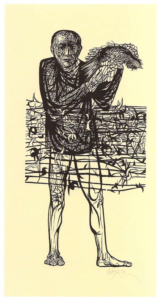
This was a great exhibition, and featured some great work. It introduced me to 2 amazing artists that I had never before encountered, Louis Lozowick and Leonard Baskin.
Louis Lozowick was an American Precisionist, and created some fantastic images of New York city using print and illustration techniqies. Something about his works really speaks to me, and keeps me enthralled. Maybe its the precision of his work, or maybe its just that I love dark images of urban landscapes.


Leonard Baskin was a celebrated american printmaker and illustrator. His work is quite diverse, and he created quite a of of work during the second world war.
He had 2 amazing pieces at this exhibition, 2 prints entitled 'Man of Peace' and 'Hydrogen Man.'
I found these 2 pieces fascinating. Both are anti war illustrations and both I feel are very powerful. His 'Hydrogen Man' piece was my favorite in the whole gallery.


Craft and Design

Yesterday I ventured out into the rain to the Craft and Design centre in the Northern Quarter. I hadn't been there in a while and it was a very refreshing change to the hustle and bustle of most of the city centre. They have some great stalls selling art, jewellery, textiles and more. I got some great ideas for Christmas presents and also for some self directed projects.
The most interesting part of my trip was the current 'Yarn Forward' project, whereby people send in small knitted sections to add to the craft centre 2nd floor banister, to create a huge, flowing tapestry like piece of art!
I forgot to take my camera, however below is a link to the Yarn Forward blog, plus a link to the Craft and Design Centre site.


Yarn Forward

Craft and Design Centre

Microbiology and Art.

On thursday I attended a lecture by the special collections library entitled 'Microbiology and Art.'
The Lecture was about how microorganisms are infact very beautiful creatures, and how they have been used for art, as well as the correlations between the development of the science and the developments of art.


The lecture involved all sorts of interesting facts, such as how stress affects the growth of microorganisms, creating different looking colonies, and how architects use the same structures as viruses for some architectural projects (such as the eden project.)
We were also shown various art projects inspired by microbiology, such as some beautifully intricate glass models of funghi, and a collaboration between the muscular dystrophy foundation and somerfield where a double helix based upon the structure of DNA (or Deoxyribonucleic acid, if we're getting scientific) was created out of shopping trolleys! 


I found this lecture hugely inspirational, as I have studied quite a lot of science (I almost decided upon going to medical school before I opted to go to uni to study design instead) and still find it fascinating. I could see so many correlations between this subject and the process of generative design, another subject very close to my heart. It reminded me most of Universal Everything's 'Seconde Nature' reactive identity system:


Seconde Nature / Reactive Identity from Universal Everything on Vimeo.

This has really got me into looking at generative design again. If anyone reading this is interested, there is a great site full of generative stuff right HERE

Wednesday, 11 November 2009

Placement with The Designers Republic.


In October, I undertook a 2 week placement at The Designers Republic in Sheffield.
This was a huge thing for me, as not only are the Designers Republic one of the most famous design studios around, they are also my favorite.
I was initially asked to come for a placement way back in may, however due to miscommunication and sheer lack of organization, it didn't happen until October.


Being so notorious, I was rather nervous upon my first day. The 55 minute train Journey seemed to take forever, and I didn't no whether to be giddy or terrified. After all, my work would be scrutinised by Ian Anderson, who I know from previous experience is certainly not afraid to speak his mind!
Once I got there I realised I had nothing to be afriad of. The studio has a very friendly, creative atmosphere, all to the backdrop of Ians eclectic music taste.
I set about working on some ideas for the new Gatecrasher album that tDR are working on. They wanted the album art to reflect Pink Floyds 'Wish You Were Here' (as the last gatecrasher album was based on Dark Side of the Moon.) I was responsible for coming up with design for the CD's themselves, a harder task than I originally thought it would be! The Designer Republic tagline is 'Brain Aided Design' and I can now completely see what that means, as everything tDR to needs to have a lot of thought behind it. So, I spent the first few hours thinking and making quick sketches, determined to have some good ideas before I got onto Adobe Illustrator.
Note that although I used Illustrator, Macromedia FreeHand is the preferred method of computer aided design at tDR, Ian says that the way it works makes you 'think about what you are doing a lot more.' However, as I was only there for 2 weeks, I used Illustrator as I wouldn't be able to work on a program I didn't know!
This way of working (thinking a lot more and making sure you have plenty of good ideas) is actually quite new to me, as I usually jump onto the mac way too quickly. However I have discovered that I can design much better when I bother to think beforehand...
The CD design actually took days, as I created about 70 different ideas all made in illustrator to present to Ian.
I also worked on the imagery for the inlay booklet. I was given the task of finding images of people at Gatecrasher clubs losing themselves in the music. I found about 50 images in the end, which Ian wanted cropping right into their faces, so that all you would be able to see in the inlay was faces. After cropping them all, I was given the talk of editing them in photoshop to give them a 'warm, saturated feeling' (as fire is used on the Wish You Were Here album cover, and this idea was to be continued in the inlay.) I eventually had about 120 images of faces that were cropped and adjusted in Photoshop, and presented them to Ian. Much to my relief, he loved them, and picked out some for the final artwork.
I also created the templates for the Flyers to promote the gatecrasher club anthems tour, which is below.


In the 2 week Placement I also designed a logo and some concept Ideas for a leeds clubnight called Masters of Funk. I based the logo on old 70's funk logo's (which turn out to be very similar to 80's thrash metal logo's in terms of visual style.) I only spent a day or so on these, and so the results (below) are not amazing, although i'm quite happy with the logo.


For the Designs, I tried to keep some kind of designers republic look (hence the angular, vectorised logo) but also a look that fit with the sensibilities of the clubnight.

As well as doing work, I also documented everything I did, as my dissertation project is based upon the placement. I kept a time sheet of each day and recorded all my tasks. I also took hundreds of pictures of past tDR work, not only as a reference point for the look of my project, but also as an archive of their past work.
I've uploaded all these photo's to flickr HERE
(more will appear next month, flickr only lets me upload 200 photos per month. How shit.)


Hello There.

Contrary to popular belief, I have not died or disappeared, nor have I become completely uncreative. I have had complete lack of internet at my new house for 2 months, making the act of blogging rather hard.
I now have internet. I can blog once again.
I will start updating much more regularly, and try and catch up on all that I have not talked about in this time.


Monday, 19 October 2009

Unbelievably Awesome

This is the worlds first site with Audio Visual Navigation.


I don't think I need to stress how awesome this is!

The site is live HERE

Go look and Play :)


PS I will update this blogg very soon with all that I have been up to for the past couple of months, including all my uni work and my current placement at the Designers Republic.